

Ricoh
Where Medicine Meets Engineering: A Smarter SaaS for 3D-Printed Organs
Ricoh’s 3D printing SaaS helps doctors and engineers collaborate on custom organ models, but workflow inefficiencies and a complex UI created friction. I led a UX/UI redesign to streamline collaboration, order tracking, and usability—ensuring faster medical workflows.
My Role
Product Designer
UX Research
Re-brander
UX Writer
Company
Matrix
Teams
Product Manager
Project Manager
R&D Team
Year
2020 - 2021
Challenges: Why the UX Needed an Overhaul
Ricoh’s platform had great potential, but doctors and engineers struggled with:
Manual Order Tracking → Engineers wasted time on inefficient workarounds.
Slow Model Approvals → Doctors faced delays due to complex navigation.
Overloaded UI → Too much information slowed decision-making.
🎯 Our Goal
Redesign the platform to simplify workflows, improve communication, and enhance usability, ensuring seamless collaboration between doctors and engineers.
User Research: Who We Designed For
Doctors – Needed a faster, simpler way to review 3D models.
Engineers – Required better tracking & structured collaboration tools.
To ensure that the platform was redesigned to fit the needs of both groups seamlessly, we created the following personas:
Ideation: How We Designed a More Intuitive Platform
We explored various design solutions to improve:
📊 Smarter Order Management – Engineers now track & modify orders in real time.
🔄 Intuitive 3D Model Reviews – Doctors can approve designs seamlessly.
💬 Clearer UI & Navigation – Data prioritized & decluttered.
Each idea was tested for:
Feasibility – Could it be implemented smoothly?
User Impact – Would it solve key user pain points?
Alignment with Platform Goals – Did it fit Ricoh’s vision?
the main features
We focused on improving four key areas:
📊 Redesigned Dashboard – A central hub for orders, tasks, & updates.
🧾Customizable Reports – Hospitals can generate & export insights.
📑 Advanced Order Management – Engineers can track & modify in real time.
🏥 Organization (Hospitals) - Manage medical organizations & departments.
Mapping the Architecture: Designing a Frictionless Workflow
To ensure a seamless experience, we mapped the main flow for each persona within Ricoh’s platform. This process helped us:
Visualize the right flows – Identified bottlenecks and inefficiencies in the existing system.
Streamline Order Management – Optimized the process of placing, tracking, and reviewing orders.
Ensure Seamless Communication – Aligned workflows between doctors and engineers to reduce delays.
This structured approach laid the foundation for a more intuitive and efficient information architecture:
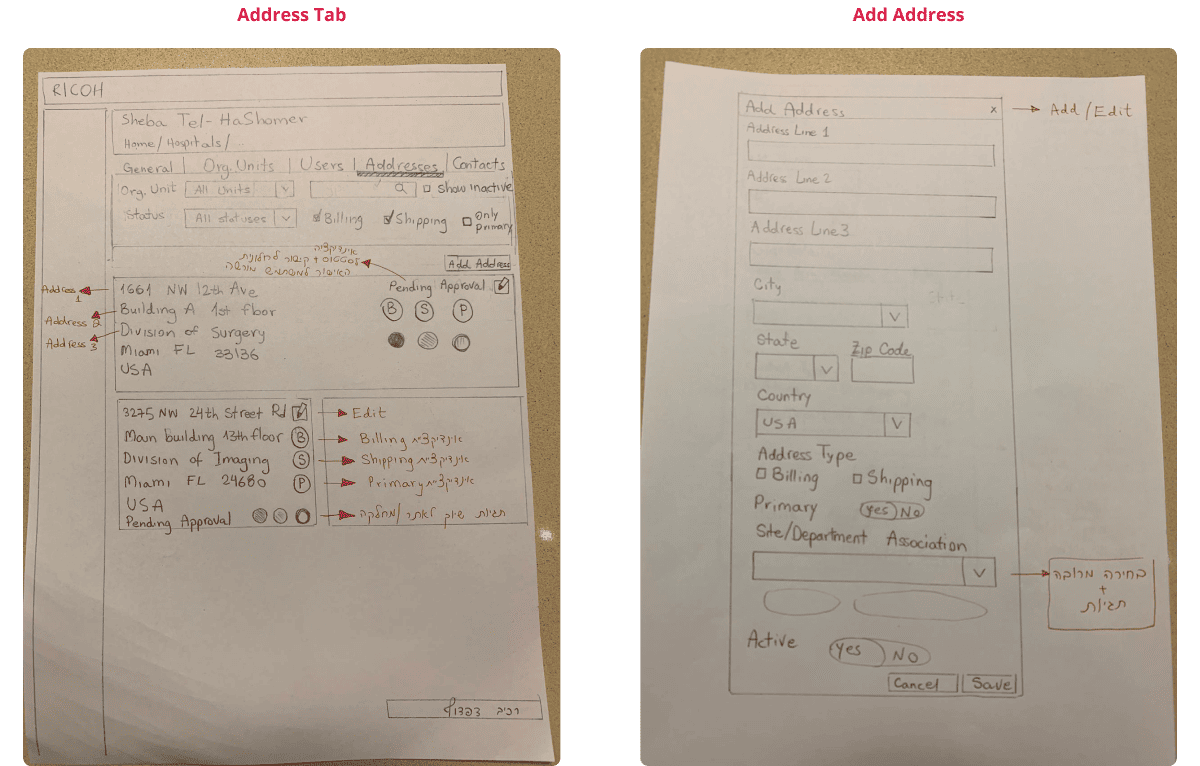
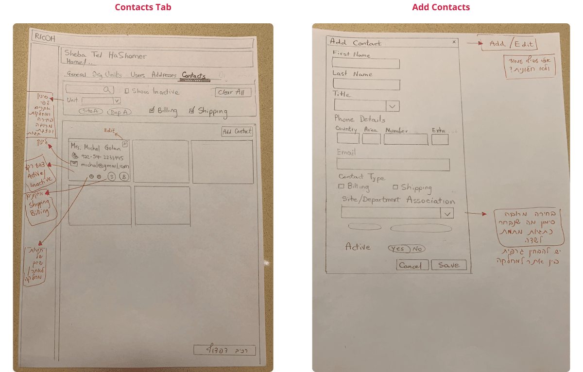
Wireframing: Laying the Foundation for a Better UX
To validate our redesign, we collaborated with Ricoh’s U.S. team, focusing on:
Planning Sessions – Aligning user priorities and key objectives.
Low-Fidelity Wireframes – Quickly test layouts before investing in high-fidelity designs.
Iterative User Testing – Adjusting based on real feedback we already got from doctors and engineers.
Key Improvements Based on Wireframe Testing:
Reduced navigation complexity → 50% fewer clicks per workflow.
Clearer Actioning→ Making important actions stand out.
Focused user journey → Ensuring users always knew their next steps.
See examples of some of the wireframes we worked on below:

Bringing Ideas to Life: A User-Centered Redesign
Our goal was to transform Ricoh’s platform into a clear, functional, and intuitive interface, ensuring that users could quickly find critical information with minimal cognitive effort. To achieve this, I followed five core design principles:
Clarity – A clean, minimalist layout with clear labels to simplify navigation.
Consistency – Standardized typography, spacing, and color schemes to create a cohesive experience.
Hierarchy – Strategic use of font weights & color emphasis to guide user actions.
Accessibility – High-contrast visuals and optimized button sizes for better usability.
Responsiveness – A design that adapts seamlessly across desktop and mobile.
These improvements significantly enhanced usability while maintaining Ricoh’s brand identity and ensuring a smooth, intuitive experience for all users
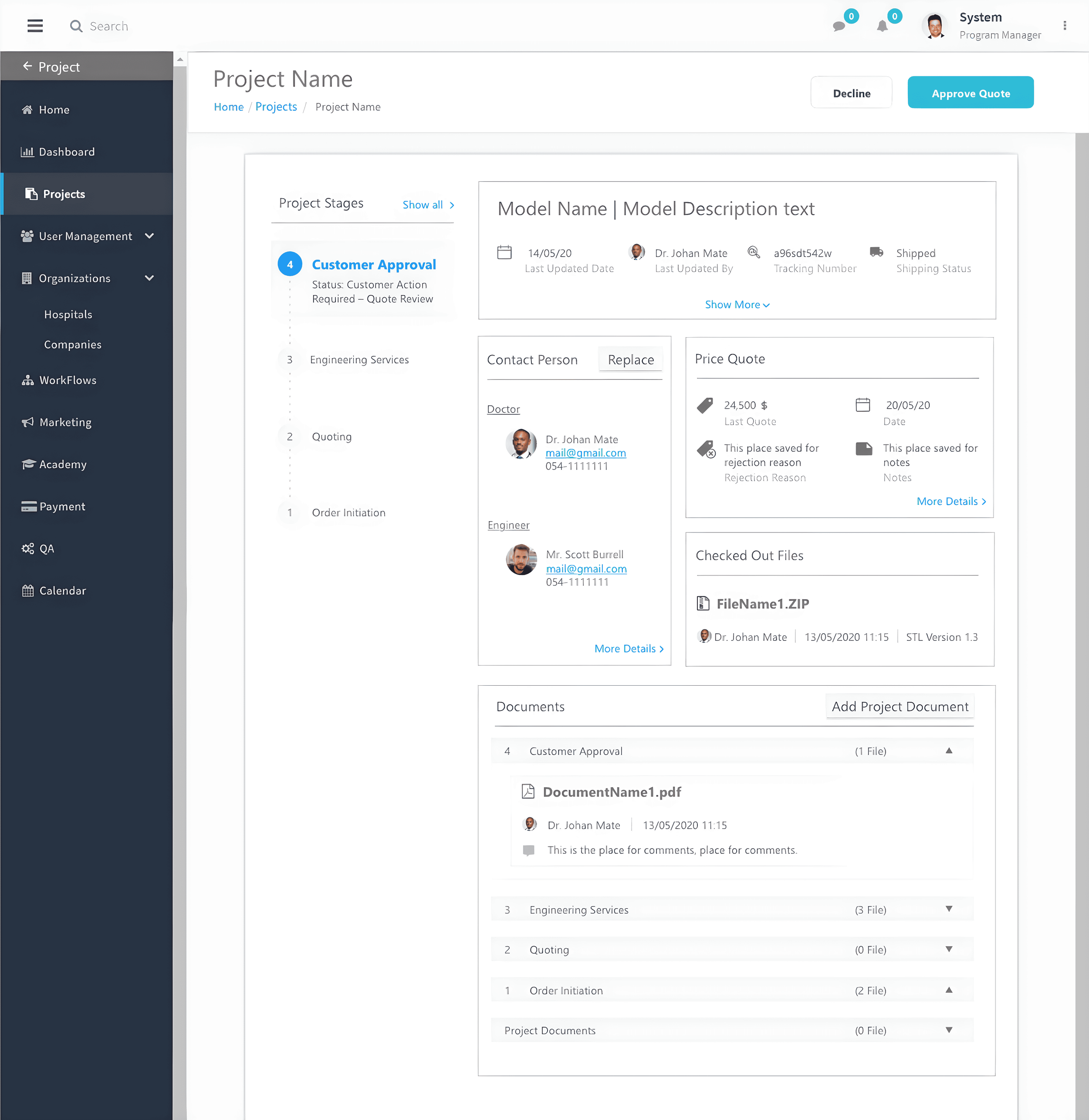
Old vs. New: Solving UX Challenges Through Design
Before the redesign, users struggled with cluttered screens, unclear navigation, and inefficient workflows. We focused on streamlining the UI to improve:
Dashboard Navigation – Reduced visual clutter and prioritized key actions.
Order Information – Improved data structuring, making it easier to track order progress.
Below are two key screens, showing the transformation from before to after.
Dashboard Screen
-
![Before Redesign → Problems:]()
Overloaded UI – Too many competing elements created visual clutter.
No clear task hierarchy – Users didn’t know what to focus on first. -
![After Redesign → Solutions:]()
Focused User Flow – Key actions are now prioritized.
Cleaner UI – Less noise, more clarity in task management.


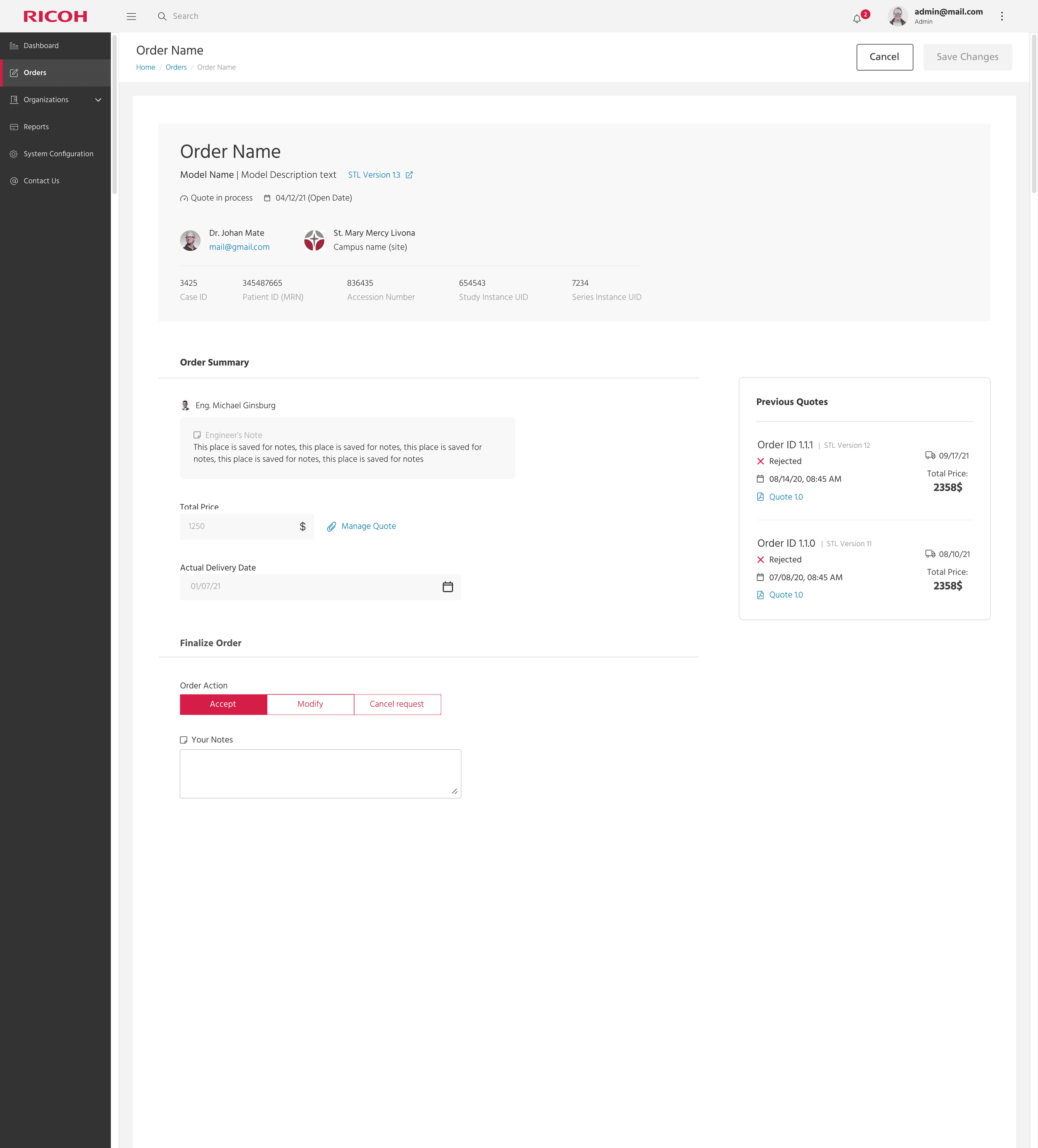
Order Information
-
![]()
Before Redesign → Problems:
Confusing Layout – Data wasn’t structured logically.
Difficult to Find Details – Users struggled to locate specific orders. -
![]()
After Redesign → Solutions:
Reorganized Data Structure – Users can now quickly locate, edit, and manage orders.
Improved Readability – Enhanced font hierarchy and spacing.
User Testing: Data-Driven Refinements
📌 50% Fewer Clicks → Optimized workflows for faster navigation.
📌 Clearer Information Architecture → Data is now easier to find.
📌 Improved Collaboration Tools → Engineers & doctors communicate seamlessly
These refinements ensured real-world usability while aligning with Ricoh’s business needs.
You can view the simple version of the MVP below:
User Feedback: What Medical Experts & Engineers Said
To validate our design decisions, we conducted detailed surveys with medical professionals and engineers who use Ricoh’s platform daily. Their feedback highlighted key improvements and remaining opportunities for growth.
🩺 Medical Professionals (Doctors) Feedback
“The new dashboard makes it much easier to track my orders. No more digging through emails for updates.”
“Reviewing 3D models remotely has been a game-changer. I can now collaborate with engineers much faster.”
“The order submission process is far more intuitive. I no longer get stuck trying to fill in complex specifications.”
🧰 Engineers Feedback
“Having all necessary specifications organized in one place has sped up order processing significantly.”
“We’ve seen a noticeable decrease in errors thanks to improved data entry fields and automated validation.”
“The structured communication tools drastically reduced back-and-forth messaging, saving us hours of clarification.”
Delivering Results - Quantifiable Impact
User Survey - Redesign Improvements (Scoring)
Impact of the Redesign Based on User Surveys
The survey results, visualized in the bar chart, highlight the significant improvements achieved through the redesign.
| Metric | Before Redesign | After Redesign | Total Improvement (%) | 📦 Order Tracking Accuracy | 73 | 93 | +28% |
|---|---|---|---|
| 💬 Team Communication Efficiency | 62 | 91 | +52% |
| 🎯 Overall User Satisfaction | 64 | 88 | +24% |
These results confirm the success of our user-centered approach, delivering measurable impact across key workflows.
Survey Conclusions
The redesign significantly improved usability across all key areas.
Users found the interface more intuitive, leading to faster workflows and less frustration.
Improved communication boosted team collaboration, reinforcing the importance of a well-structured interface.
These insights validate the effectiveness of our user-centric approach, ensuring the new platform not only meets business needs but also enhances user efficiency and satisfaction.
Lessons Learned & Next Steps
🏅 Challenges Faced & How We Overcame Them
Asynchronous & Synchronous Collaboration
Balanced real-time meetings with structured async updates to accommodate different time zones.
Maintained weekly syncs and well-documented design decisions to ensure alignment.
Cross-Disciplinary Coordination
Worked closely with Product Designers, Developers, and Medical Experts to ensure usability met medical industry standards.
Early-stage wireframing included engineers and stakeholders to validate feasibility before moving forward.
Iterative Feedback & Testing
Conducted user testing across multiple regions to ensure the platform met diverse user needs.
Design changes were informed by both Israeli and American teams, leading to a holistic and inclusive approach.

Looking Ahead: Future Enhancements
📱 Mobile Optimization – Enhancing accessibility for on-the-go users, especially for 3D model reviews.
📂 Templates & Saved Preferences – Improving order tracking and validation for frequent users.
🖥️ Enhanced 3D Interactivity – Upgrading 3D model visualization tools for more advanced medical model reviews.
Key Takeaways: What This Project Taught Me
The Power of Cross-Team Collaboration
Diverse perspectives helped shape a platform that serves both medical professionals and engineers.Documentation & Communication as a Game-Changer
Establishing clear workflows reduced confusion and improved execution speed.The Value of Continuous Testing
Frequent user testing led to iterative improvements, ensuring long-term success.
🚀 Final Thought - Speeding Up the Process, Without Sacrificing Precision
3D printing for healthcare is game-changing, but the order process was slowing things down. My redesign helped streamline workflows, improve collaboration, and reduce errors—ensuring medical professionals and engineers could work together seamlessly. Now, ordering custom models is faster, easier, and more precise—so hospitals and clinics can get what they need, when they need it.