

Coho.ai
Redefining Customer Segmentation for Smarter Engagement
Coho.ai’s powerful segmentation tools had potential, but users struggled with complex navigation, unclear insights, and static engagement workflows. Our UX redesign transformed raw data into actionable insights, helping businesses improve retention and conversions effortlessly.
My Role
UI/UX Designer
User Research
Product Strategy
Company
Coho.ai
Teams
CEO and CTO
Head of Product
PM and R&D Team
Year
2023 - 2024
The Problem: Too Much Complexity, Too Little Flexibility
Unintuitive Navigation – Users struggled to find key insights.
Insights Without Action – Marketers lacked step-by-step guidance.
Rigid Engagement Journeys – Static workflows reduced effectiveness.
💡 Result? Many teams abandoned segmentation entirely, leading to missed engagement opportunities. (See example below)
User Personas: Who We Designed For
Growth Marketers → Needed faster, more flexible segmentation tools to personalize outreach.
Data Analysts → Wanted automated reports & predictive insights to act on trends quickly.
Customer Success Teams → Required simplified workflows for better engagement tracking.
User Research: What We Discovered
We analyzed session analytics, user interviews, and growth team feedback to identify pain points:
📉 High Drop-off Rates – Users abandoned segmentation workflows mid-process.
🤷 Lack of Clear Actions – Marketers needed step-by-step guidance.
🔍 Data Overload – Users struggled to interpret raw insights.
⏳ Slow Decision-Making – Insights weren’t presented in a digestible way.
💡 Our takeaway: The segmentation tool needed to be faster, more flexible, and more intuitive to drive user adoption.
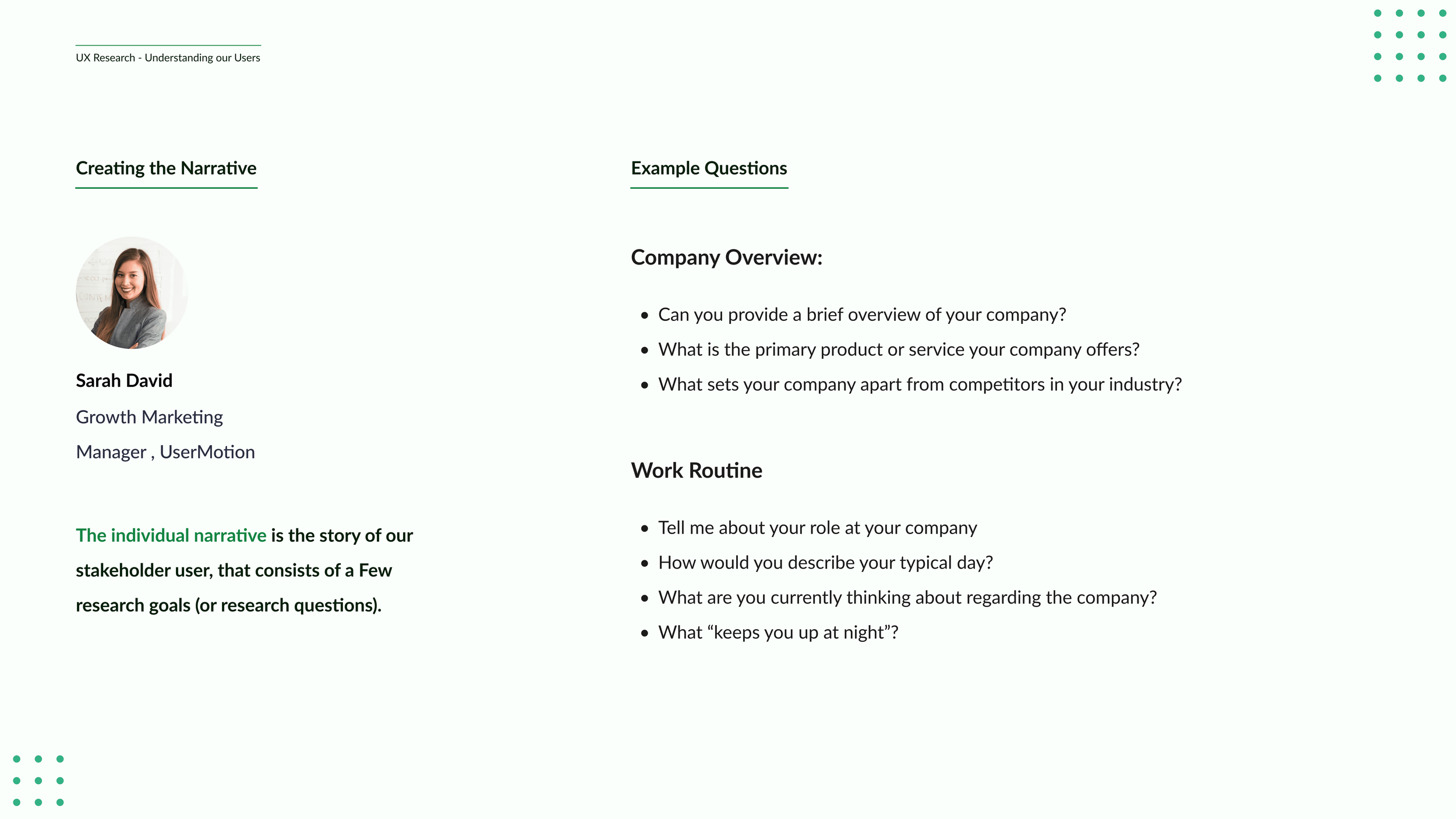
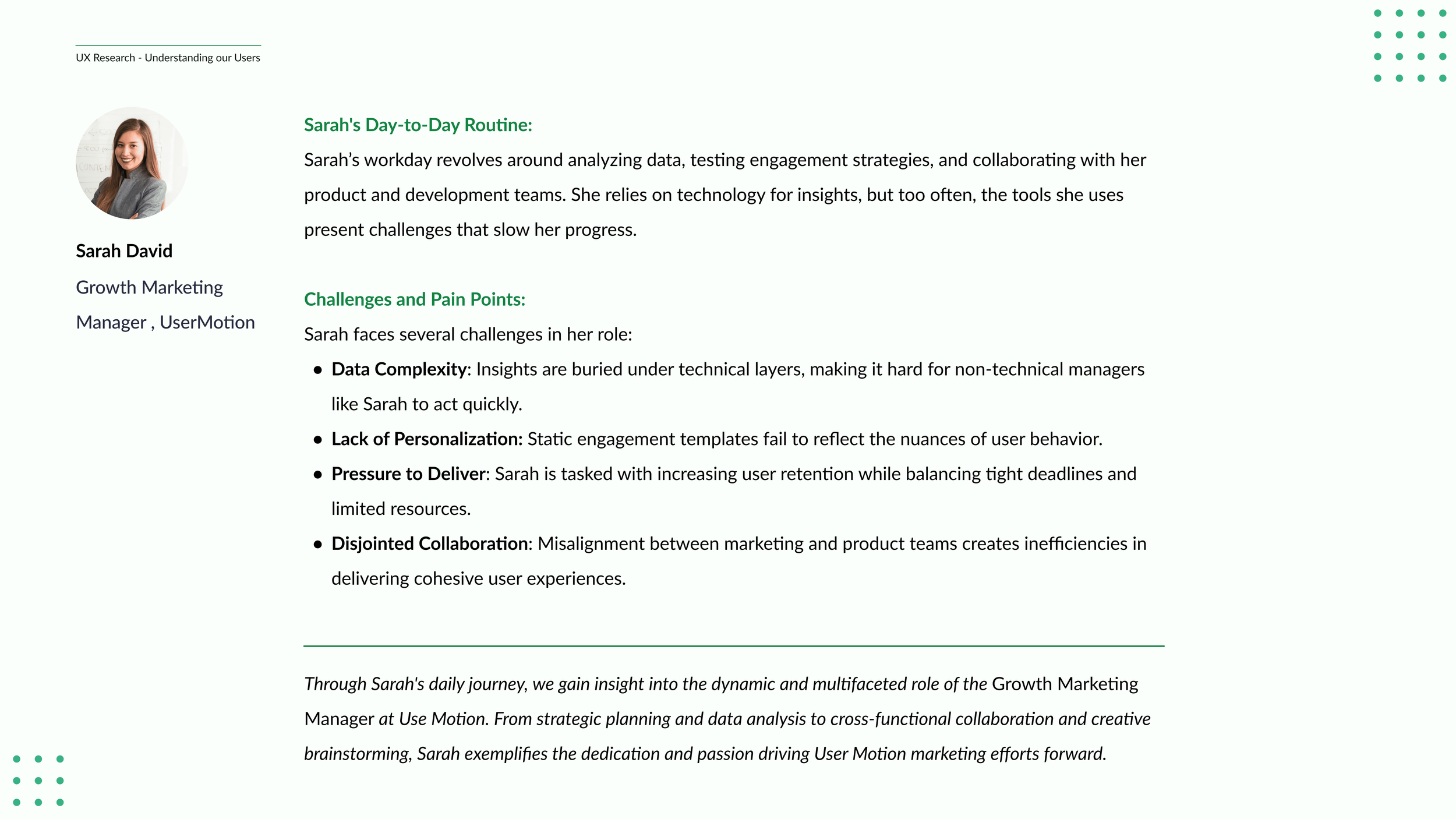
Champion of the users
A pivotal moment in this project was advocating for user needs in strategic product meetings. I presented an updated perspective on our personas, demonstrating how marketing managers and product owners could enhance engagement through personalized interactions. This presentation is presented below:

Redesigning Coho.ai: Experience Improvements
| 🚫 Old Experience | ✅ New Experience |
|---|---|
| Raw data with no guidance | Next-best action recommendations |
| Cluttered UI, hard to find insights | Streamlined dashboard with clear KPIs |
| Static workflows | Adaptive workflows based on real-time data |
Clear Logic Selection: Redesigned "AND"/"OR" filters for intuitive setup.
Flexible Input Methods: Users can search, bulk upload, and auto-save segments.
Real-Time Validation: Live feedback prevents errors before saving.
-
![]()
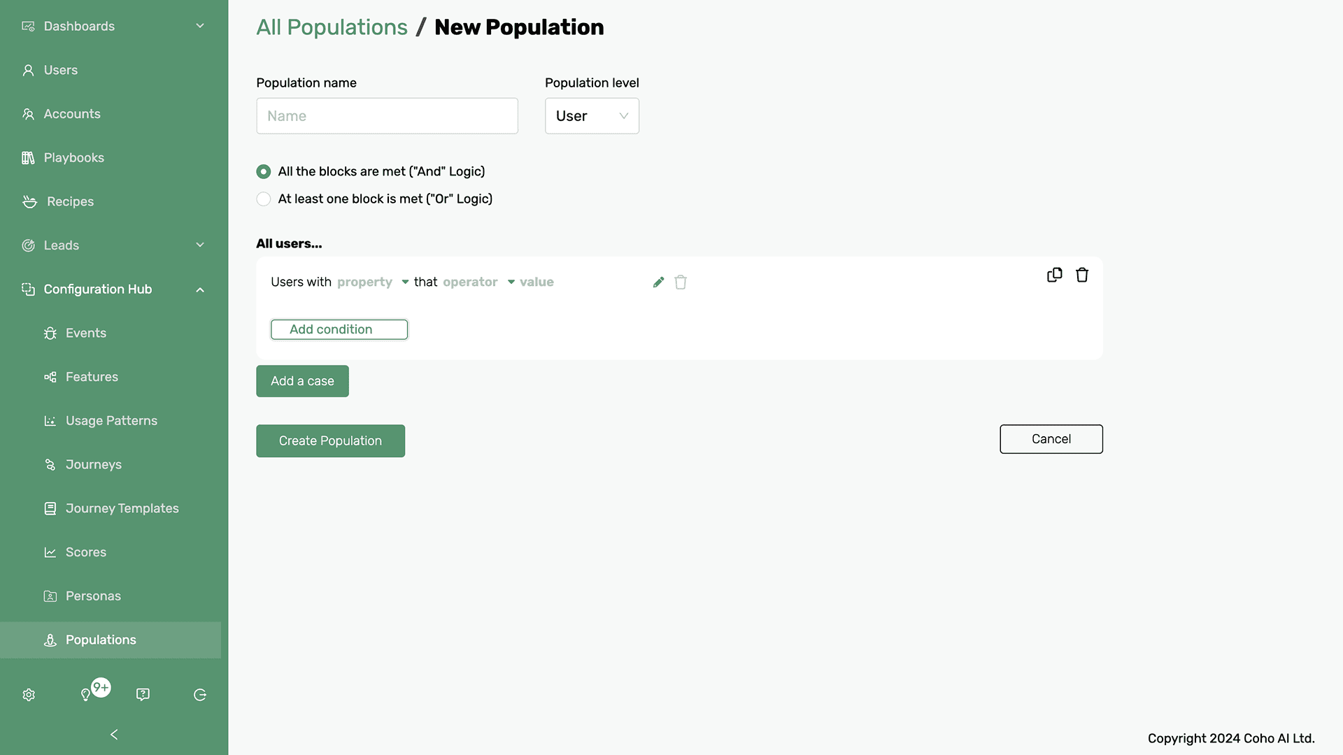
Problems with the old Design Approach
Modal-based interfaces like the old design often presented several key issues:
● Confined workspace that limited complex operations
● Poor visibility of system context and navigation
● Cognitive overload from densely packed information
● Limited flexibility for future feature expansion
● Awkward handling of multi-step processes
● Reduced accessibility on smaller screens -
![]()
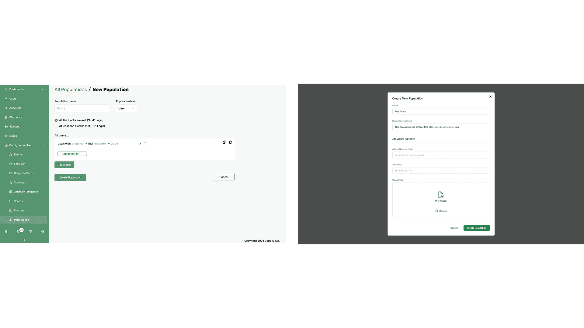
Evolution to Modern Interface
The new design demonstrates several meaningful improvements:
● Modal-based interface with focused, single-purpose layout
● Simple, step-by-step user flow:
○ Basic population details (name, description)
○ Multiple user addition methods (Name/Email, ID, CSV upload)
● Clean visual hierarchy with clear section separation
● Streamlined CSV upload with visual feedback
● Prominent primary actions (Create Population, Cancel) -
![]()
Old vs New Design Comparison Summary
🚫 The Old Design:
• Limited workspace – Users struggled to handle complex operations.
• Poor navigation visibility – Users had to search extensively for key features.
• High cognitive load – Too much information at once overwhelms users.✅ The New Design:
• Full-screen workspaces for better usability.
• Simplified navigation with clear hierarchies and quick-access menus.
• Modular design for future scalability and feature expansions.

Individual redesign impact on our Client
Since the designs are confidential, we will focus on their transformation and impact. A prime example is Any.do, where our redesign directly addressed key pain points and led to measurable improvements.
1. Establishing Baseline Data (Before Redesign)
Before making changes, we analyzed Any.do’s platform performance and gathered user feedback to pinpoint key friction points.
🔎 Key Findings:
Navigation Issues – Users spent too much time searching for insights, reducing efficiency.
Low Feature Adoption: The “Team Collaboration” feature had poor engagement due to unclear action steps.
High Drop-off Rates: Non-technical users struggled to interpret data, leading to frustration.
📊 How We Collected Data (Pre-Redesign):
Heatmaps & Session Recordings – Tracked user roadblocks.
User Interviews – Gathered feedback from growth teams & PMs.
Feature Usage Data – Measured adoption of “Team Collaboration.”
Time-to-Action Metrics – Assessed time spent finding insights.
2. Tracking Post-Redesign Performance
After launching the new UX improvements, we measured the impact using the same evaluation methods. The key metrics we focused on are presented in the chart below:
Before vs. After Redesign - Any.do Impact
3. Measurable Impact of the Redesign
| Metric | Impact After Redesign |
|---|---|
| ✅ +58% More Trust | Users reported higher confidence in data accuracy and reliability |
| ⏳ +81% Productivity Boost | The streamlined UI reduced friction, making workflows significantly faster |
| 📊 4X Clearer Insights | The new analytics page provided concise, actionable data, improving decision-making |
| 🚀 +50% More Efficient Workflows | Optimized playbooks reduced unnecessary steps, enhancing usability |
| 🎯 +116% Higher Engagement | Users interacted more with insights and data-driven recommendations, adjusting strategies based on real-time feedback |
“The new workflow feels effortless. We can find what we need without guessing. This update completely changed how we use Any.do for team collaboration.”
Reinforcing the Results & Reflections
Measuring the Impact of the Redesign
After the successful Any.do testing phase, we rolled out the redesign across our broader client base. The results confirmed significant improvements across key performance areas:
User Survey - Redesign Improvements (Scoring)
| Impact Metrics | Impact After Redesign |
|---|---|
| ✅ +54% Enhanced Trust | Users had more confidence in decision-making due to clearer, more reliable data. |
| ⏳ -50% Less work | The new UI cut manual effort in half, improving productivity. |
| 📊 X3.5 Clearer Insights | Insights were now clearer, more digestible, and actionable. |
| 🚀 +43% Workflow efficency | Optimized playbooks reduced unnecessary steps, enhancing usability. |
| 🎯 +112% Higher Engagement | Personalized journeys kept users interacting with the platform longer. |
After launching the redesigned UX, we saw significant gains in efficiency, engagement, and decision-making. Using the same research framework from our Any.do study, we consistently tracked and validated key impact metrics across clients:
How We Measured This:
User Feedback Surveys – NPS scores and qualitative feedback.
User Behavior Tracking – Heatmaps, clickstream analysis, and A/B tests.
Time-to-Action Studies – Measured how quickly users could navigate, extract insights, and make decisions.
Project Reflections & Key Learnings
Beyond metrics, this project reinforced the power of user-centered design, strategic iteration, and data-driven decision-making.
💡 What I Learned
Users need guidance, not just data – Simplifying insights boosted engagement.
Simplicity drives adoption – Removing complexity led to higher confidence & usability.
Iteration is key – Continuous feedback cycles refined the experience.
Data validates design – UX decisions backed by real impact metrics.
Storytelling builds alignment – Clear presentations drove stakeholder buy-in
🚀 Closing Thought: Designing for Productivity
Work should feel productive, not overwhelming. Coho became an intuitive, stress-free platform that empowers teams to stay focused and get things done by simplifying workflows, refining collaboration, and integrating smart task management.